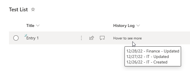
Sometimes a SharePoint column has too much information, which eventually stretches rows and distorts the look. An example below is a Multiple lines of text type column:
This simple JSON code is useful to hide noncrucial information, while still allowing easy access to that data by hovering your mouse cursor over it.
{
  "$schema": "https://developer.microsoft.com/json-schemas/sp/v2/column-formatting.schema.json",
  "elmType": "div",
  "style": {
    "display": "=if(@currentField, '','none')",
    "font-size": "12px"
  },
  "txtContent": "Hover to see more",
  "customCardProps": {
    "formatter": {
      "elmType": "div",
      "txtContent": "@currentField",
      "style": {
        "padding": "5px 5px 5px 5px",
        "border": "solid",
        "border-radius": "2px",
        "border-width": "1px",
        "box-shadow": "0 0 2px 0"
      }
    },
    "openOnEvent": "hover",
    "directionalHint": "bottomCenter",
    "isBeakVisible": false
  }
}


Thanks so much – this is exactly what I was looking for.
I am wondering, how I can implement this in the gallery view? For the list view it works fine, but it wont adapt it for hte gallery view… Thanks much for your help!
This is great. But is there a way to have this formatting apply only to the list view, and not the display form?
Hey Brian,
Not that I know, and it is annoying. However, you can build a Power Apps form that the JSON formatting won’t apply to.